Portfolio
Take a moment to look through some of my selected web, logo, and print designs, as well as a few writing samples. If you like what you see, and would like to see more, please let me know. I have plenty of work to choose from!Web Design
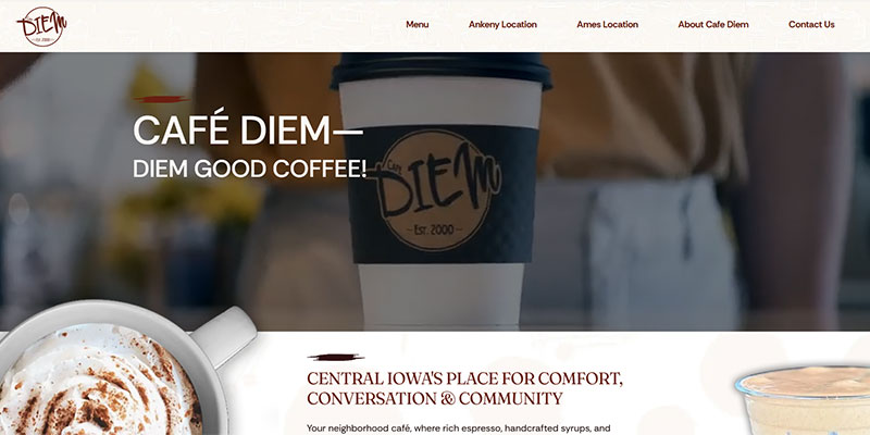
Café Diem
Designed a modern, user-friendly website for Cafe Diem that blends bold visuals, seamless navigation, and responsive functionality to elevate the brand’s online presence with style too.
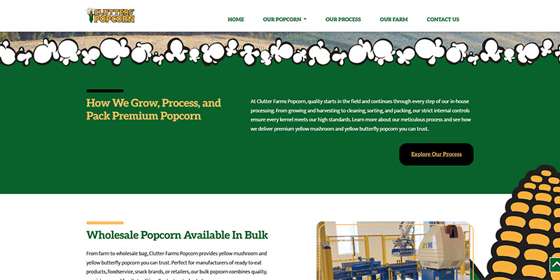
Clutter Farms Popcorn
I was able to do a lot of fun things for Clutter Farms Popcorn, when they reached out for a new look that incorporated their current branding, and highlighted their farm-grown roots.
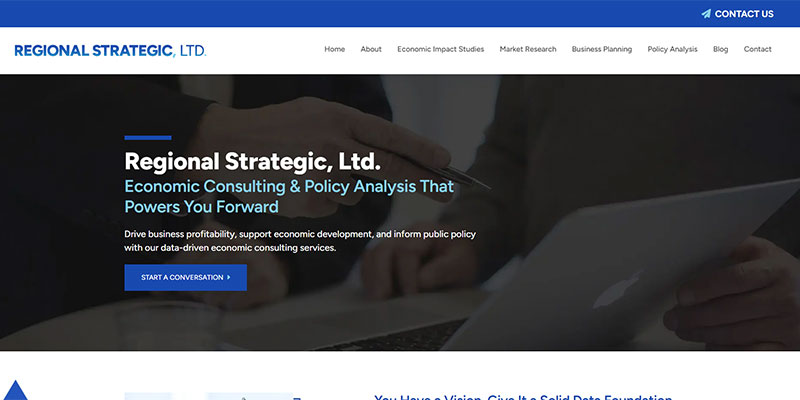
Regional Strategic, Ltd.
Built to reflect Regional Strategic’s professionalism and expertise, this site delivers a refined user experience that supports growth, credibility, and client engagement.
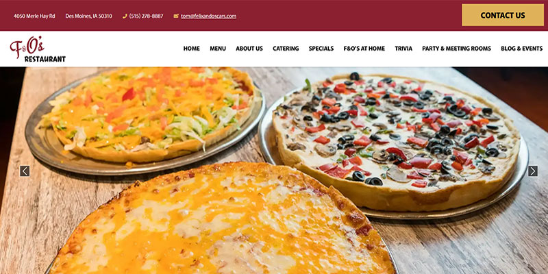
Felix & Oscar’s
Crafted a vibrant, brand-forward website for Felix & Oscars that showcases their menu and dining experience, blending personality and usability to engage guests and drive visits.
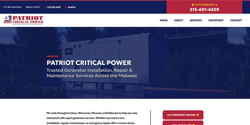
Patriot Critical Power
Engineered a streamlined website for Patriot Critical Power that emphasizes clarity, credibility, and service offerings, delivering a professional, user-friendly experience.
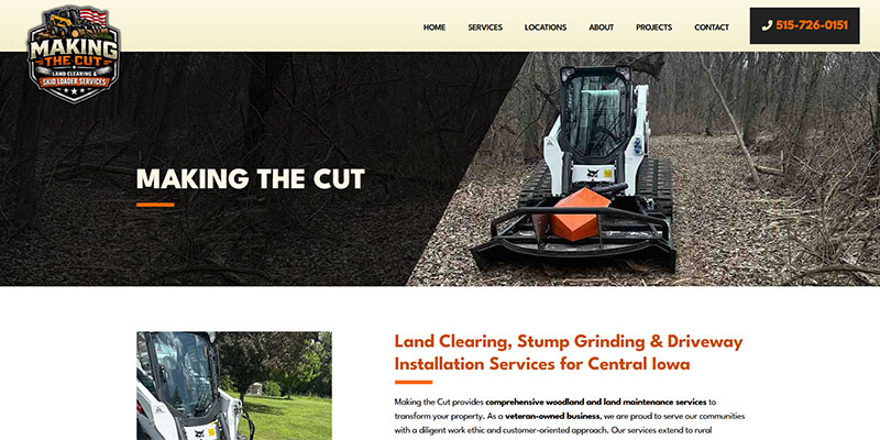
Making the Cut
Showcased Making the Cut Iowa with a bold, intuitive design that highlights their services. communities served, and was also able to design some custom icons for this site as well.
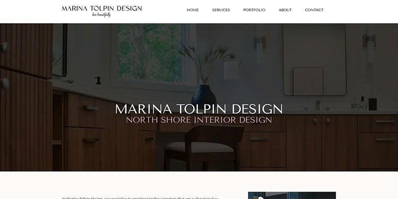
Marina Tolpin
Shaped an expressive, design-forward experience for Marina Tolpin, where a highly collaborative process with the client drove a distinct visual direction and a more personalized, artistic result.
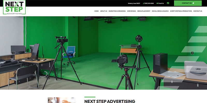
Next Step Advertising
Created a new website for Next Step Advertising, as well as a new logo and a flexible design system that reflects their diverse clientele and wide range of marketing solutions.
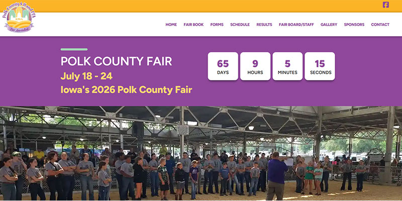
Polk County Fair
Redesigned Polk County Fair with their updated logo, creating a more modern, accessible site that highlights events, tradition, and community engagement with improved usability throughout.
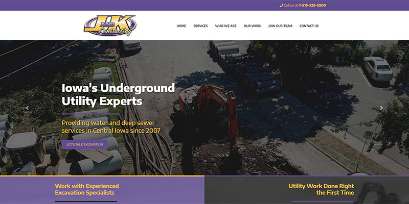
J & K Contracting
The priorities for this underground utility and excavating company included freshening up the site and implementing printable and online applications for potential employees.
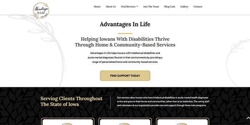
Advantages In Life
Designed and built a clean, purpose-driven site for Advantages in Life that communicates value clearly, supports user trust, and guides visitors through services with ease and confidence.
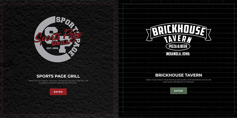
The Sports Page Bar & Grill
These clients needed a dual site to share menus, catering options, locations, and more about their pizza tavern and bar and grill. The designs reflect the sporty, welcoming feel of each.
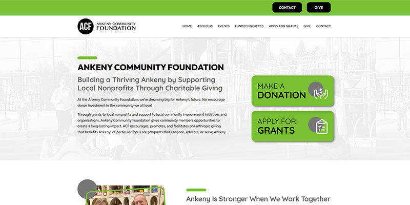
Ankeny Community Foundation
Created a welcoming, community-focused website for Ankeny Community Foundation that makes it easy to explore initiatives, support local causes, and drive meaningful impact.
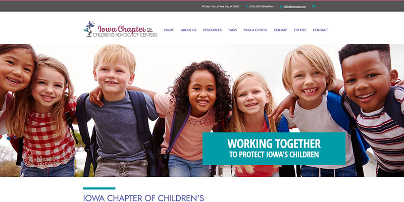
Iowa Chapter of Children's Advocacy Centers
This was a fulfilling project and the new design highlights the important mission of this organization and provides resources for those who could benefit from their services.
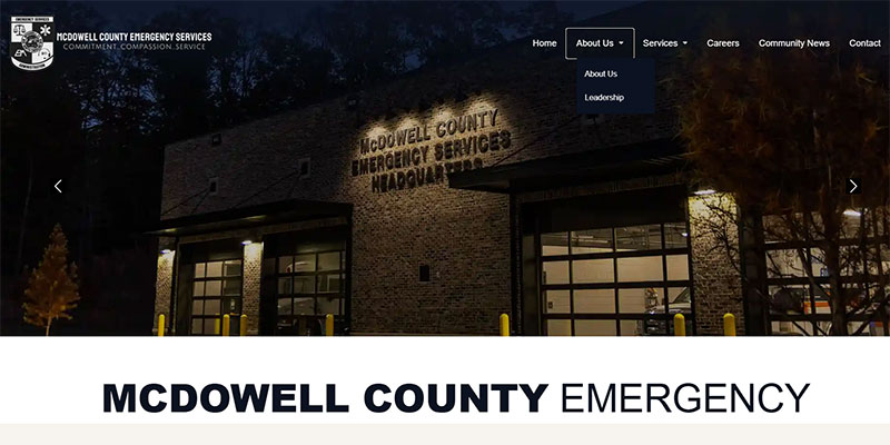
McDowell Emergency Management Services
Worked closely with McDowell EMS to execute a clearly defined vision, turning their direction into a clean, structured site that improves usability and reinforces credibility.
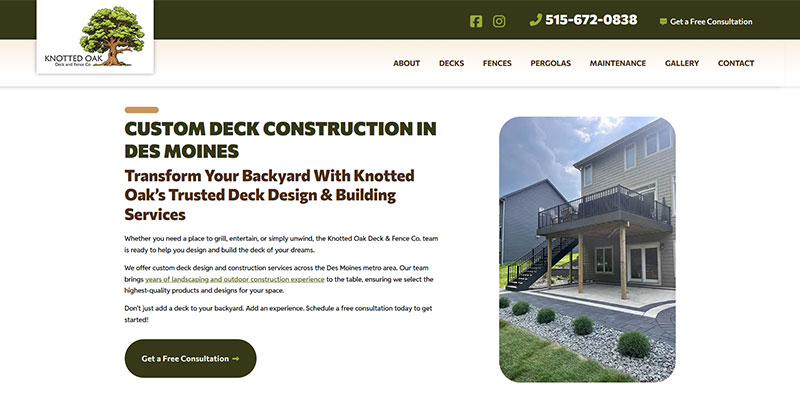
Knotted Oak Deck
Crafted a new website for Knotted Oak Deck that showcases craftsmanship and services clearly, helping homeowners easily explore options and request work with confidence.
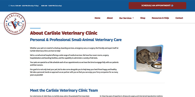
Carlisle Veterinary Clinic
Designed a welcoming, user-friendly site for Carlisle Veterinary Clinic that prioritizes pet owner needs, highlights services clearly, and makes appointment access straightforward and easy.
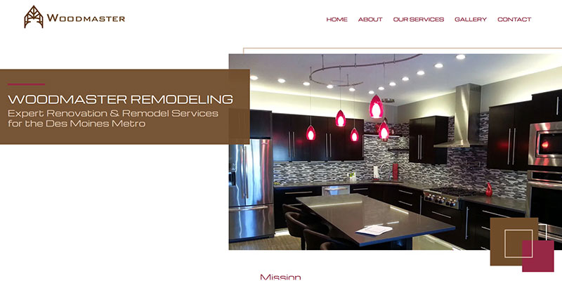
Woodmaster Remodeling
Built a refined, craftsmanship-focused website for Woodmaster Remodeling that highlights custom expertise while making it easy for clients to explore services and request consultations.
Logo Design
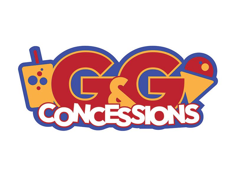
G&G Concessions
Designed the logo (and website) for G&G Concessions, a local company now serving Iowa, Nebraska, and New Mexico.This fun, new logo carries a clean, recognizable identity across both digital and real-world touchpoints, a nice reminder of local work showing up in the community and its ongoing impact. It’s really cool and rewarding to the logo I designed featured on cups for events held at Casey’s Center.
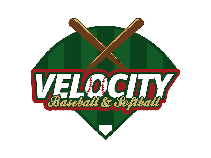
Velocity Baseball & Softball
Built a bold, sports-driven brand identity and website for Velocity Baseball & Softball, a local training organization in Ankeny focused on developing hitting and pitching skills for baseball and softball athletes. I also designed their website, creating a consistent brand identity that combined a modern take on a classic look. It was a lot of fun creating this new logo that encompassed youth sports energy into real-world impact.
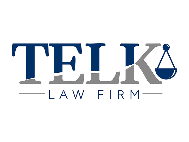
Telk Law Firm
Developed a refined brand identity for Telk Law Firm, including a custom logo and full website design and development for Telk Law Firm . The visual system emphasizes professionalism, clarity, and trust, helping present complex legal services in a clean, approachable way while maintaining a strong, credible presence across both print and digital platforms. The result is a cohesive brand experience for their clients.
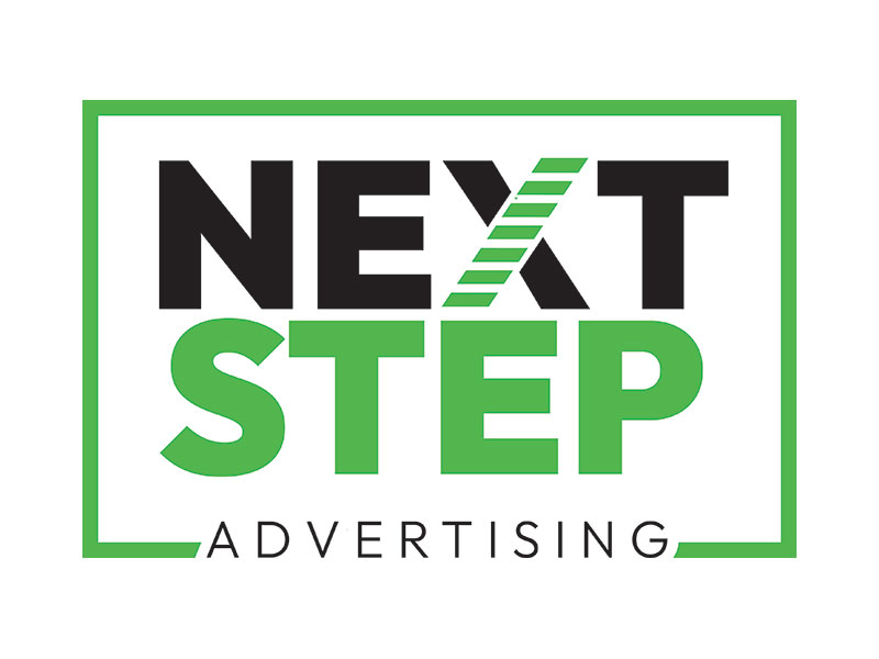
Next Step Advertising
Refreshed the brand identity for Next Step Advertising, including a new logo and website design and development for this agency located in Ankeny. The visual direction was crafted to reflect their professionalism with versatility across industries, using the stairs in the "X" as a play on their company name. The final result reinforces their trusted reputation in the metro area.
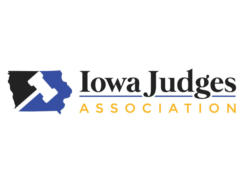
Iowa Judges Association
This logo was recently designed and created as a project for my current employerfor a client that wanted to build a website for their members. A clean, professional logo was the initial step in their branding. They requested something that would convey who they were, but one that also included an image of Iowa. They asked for blue and black, and eventually, asked to incorporate gold also.
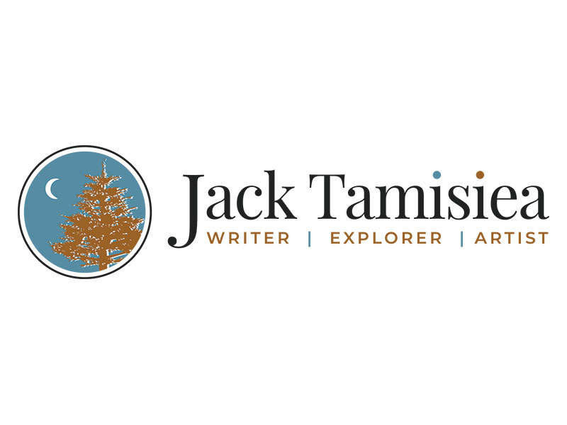
Jack Tamisiea
Another logo that was also created for a client of my current employer. Jack Tamisiea is a freelance science writer who is pursuing his Masters in Science Writing from Johns Hopkins University. In addition to his writing, Jack is also an artist and loves exploring nature. He is a man of many talents, and wanted a logo that would brand his diverse talents in order to share them with the world.
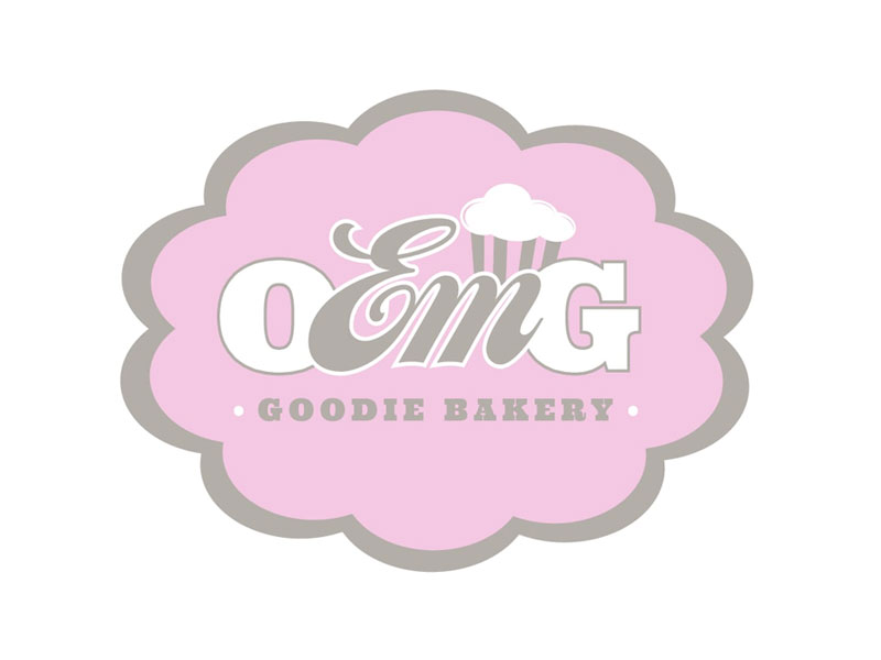
O-Em-G Goodie Bakery
This logo was created "just for fun" for my sister-in-law, Emily. She is an incredible baker and had mentioned what a dream it would be for her to open her own bakery someday. As that night progressed, I came up with the name "O-Em-G Goodie Bakery", as a play on her nickname, Em, and a newly popular catchphrase, and the rest is well...history.
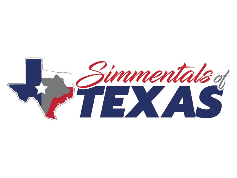
Simmentals of Texas
This logo is an example of another project that was done for a client of my currently employer who is a Simmental cattle producer in Texas. He requsted the outline of Texas, and had asked for the image of a Simmental bull to be included in some capacity if possible. I used the outline of Texas, and filled it with the Texas state flag, as well as its 'lone star', and also added a subtle silhouette of a Simmental bull head.
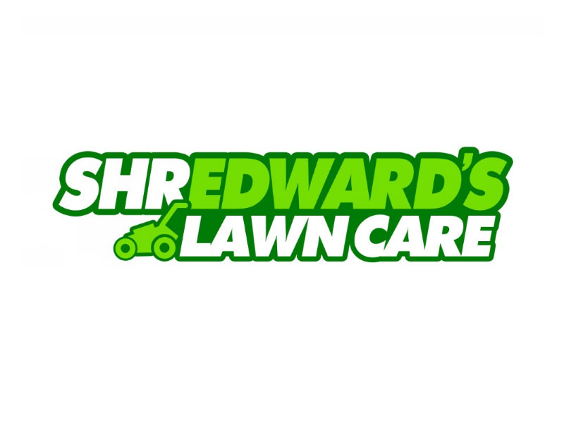
Shredward's Lawn Care
I created this logo for my nephew, Eddie, who affectionately earned the nickname "Shredward" when he decided to open a lawn care business to earn some extra cash. Since he would be 'shredding' the extra grass from his clients' yards, the nickname stuck and became the name for his side gig. Obviously, green was the obvious choice, and I created this logo for him to use on business cards, flyers, postcards, and apparel.
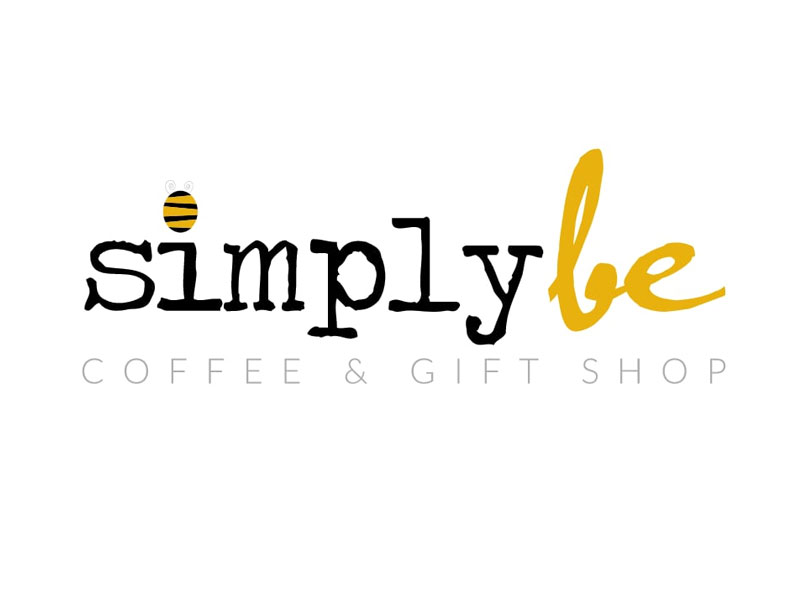
Simply Be Coffee & Gift Shop
I created this logo for my brother-in-law's sister when she expressed interest in opening a combination coffee and gift shop. She had chosen this name because she wanted those who entered to have the freedom to 'simply be' themselves. She wanted an image of a bee to be incorporated, and it ultimately became the dot of the 'i'. The colors came from the bee, and we were both pleased with the final product.
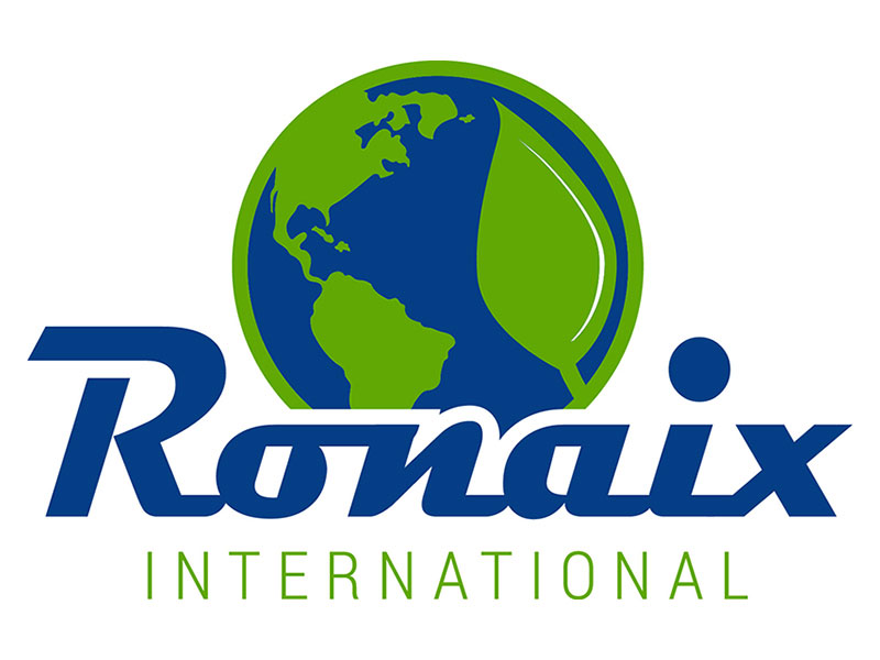
Ronaix International
Another example of a logo that was created for a client of my current employer. They hired us to brand their company, and the logo was the first step in that process. Ronaix International shares a common vision with growers around the world in the pursuit of "Green" Sustainable Intensification for their farms. Therefore, they wanted a logo that showcased their vision, so the green leaf was incorporated into the globe to represent that.
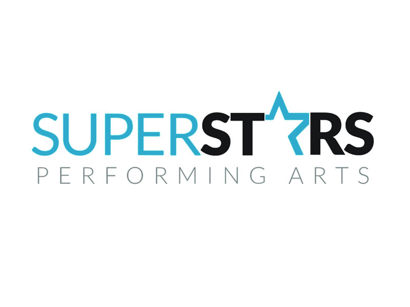
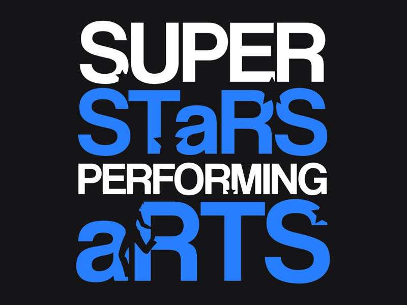
Superstars Performing Arts
I designed this logo for the studio I co-owned with my business partners. After taking over ownership, we wanted to establish a new brand that was unique to us, and one that was more updated than the previous logo. We chose new colors, and I decided to play off our studio's name by making the 'A' in our name a star. This logo has been used on all studio collateral, and was retained by the new owners as well.
Print Design
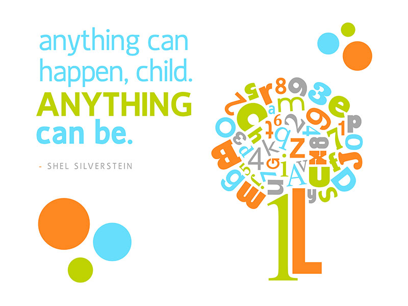
Nursery Print
I created this design for my nephew's nursery. My sister-in-law had purchased two other prints online - one with the alphabet, and other with numbers - all with random fonts, sizes, and directions. She wanted larger print to be cohesive with the others she purchased, and had requested one of her favorite Shel Silverstein quotes to be included as well. We were both pleased with the final product.
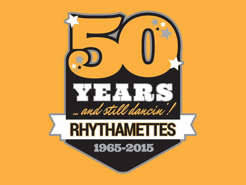
Dance Team Shirt
I designed this t-shirt for the 50th Anniversary of the dance team my wife coaches at Southeast Polk High School. The team has a long tradition of excellence, and is well-known in the state, and even nationally. Many young people have been part of the team over the years, and they wanted something with the school's colors to celebrate the team's incredible milestone.
Dance Studio Shirt
Every year, the studio I co-owned provided t-shirts to our students for them to wear for our studio events, to class, and randomly to show their pride in the studio. This was one of the shirts I designed, and it was one of my favorites, as it included our studio name along with the subtle addition of the stars and the silhouette of a performer.
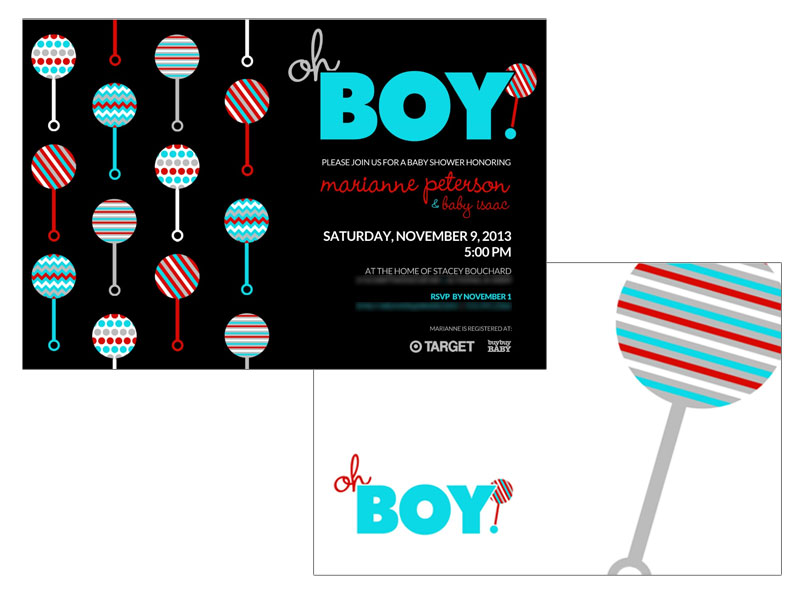
Baby Shower Invite
These baby shower invites have sentimental value and meaning to me, as they were designed by me for my son. I had always dreamed of being a dad, and the excitement surrounding our baby's arrival was something very special. My wife and I had chosen these colors for his nursery, so I incorporated them (as well as a little play on words) into the design of the invitations also.
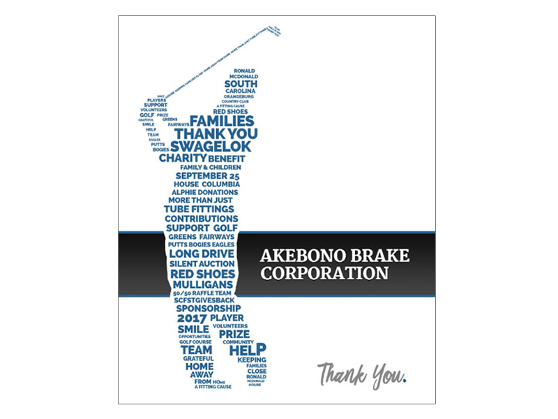
Golf Tourney Gift
This design was done for a company that was hosting a charity golf tournament who wanted to include something custom and unique to each donor's "swag bag" at the completion of the tournament. The silhouette was the company's idea, and I decided to make it out of words that had to do with the event. Each participant received a customized framed print.
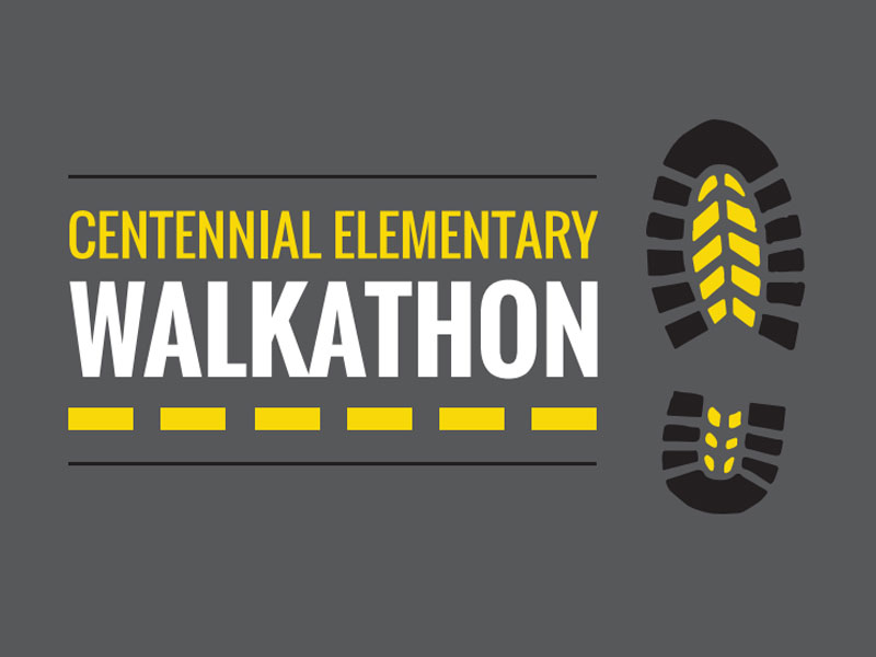
Walkathon Shirt
I designed this t-shirt for the walkathon hosted by the elementary school where my wife teaches. Every year they host this event to raise funds for the school. When word spread that my wife was married to a graphic designer, my services were requested and I was thrilled to have the opportunity to design this shirt for such a wonderful and worthy cause.
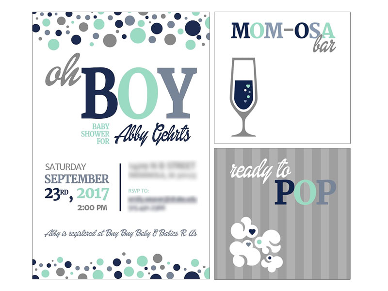
Baby Shower Collateral
These baby shower designs were created for my wife's cousin when she was expecting her first child. The colors were requsted by the host of the shower, and I had fun creating a play on words for the invite. When I found out they were having a Mimosa and popcorn bar, I couldn't resist and again had to incorporate a fun play on words for the framed prints that were included on the tables.
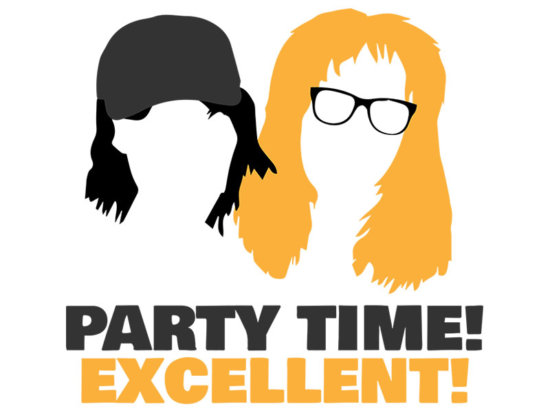
T-Shirt Design
As a teenager in the 90s, 'Wayne's World' was one of my all-time favorite sketches on Saturday Night Live, and I wore out my VHS copy of the movie from watching it so many times. I loved these characters, and thought a vintage throwback to them would be a fun project. I haven't printed this on a shirt yet, but plan to soon and will wear it with nostalgiac pride.
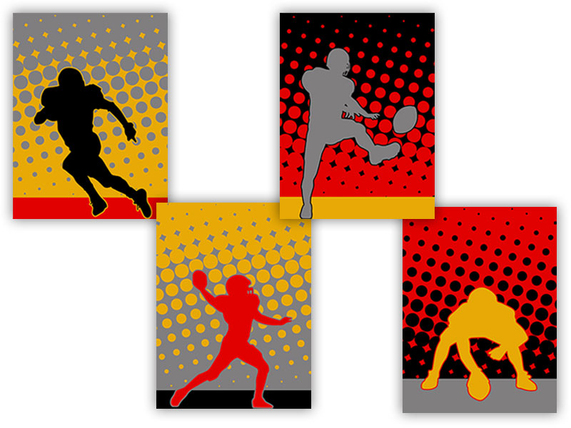
Bedroom Wall Prints
I recently designed these prints for my son's room. Over the past couple of years, he has turned into a football fanatic, and decided to include some of his favorite football positions. I used all the colors from these three teams (KC Chiefs, ISU Cyclones, and our local Southeast Polk Rams) to design these prints, hoping he would approve ... and he certainly did! They were a hit, and it did my heart good.
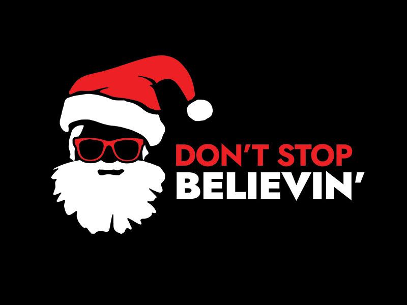
Christmas Shirt Design
As a dance teacher, I taught kids of all ages during my career. During Christmas time, I would always overhear a certain age of students debating the old "Is he real?" argument every year. It was a little heartbreaking because I knew some believed and some didn't. This shirt was my subtle way of showing support to my students who still believed. (And honestly, I'm a huge fan of Journey, too.)
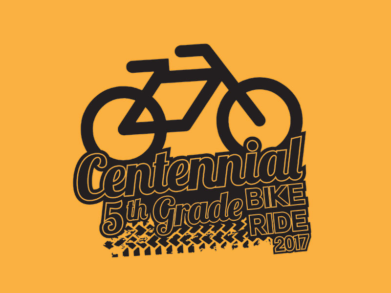
T-Shirt Design
This is one of many t-shirt designs I have done for my wife. She teaches 5th grade, and all the 5th grade students participate in an annual bike ride at the end of each school year. The 5th grade teachers supply their students with special t-shirts to wear for the occasion each year. I always enjoy working on these designs for her, and for the students to wear on their special day.
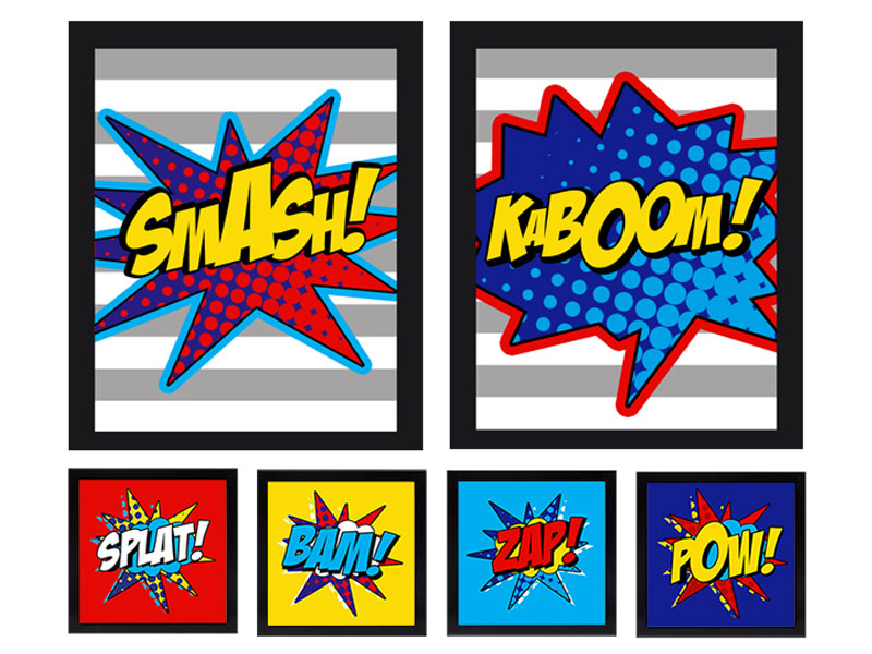
Superhero Room Prints
A few years back, my son went through a 'superhero' phase, so I designed these prints for his bedroom. I didn't want them to be character-specific, and wanted to work with the colors he had requested. These prints never made it past my computer, though, as this phase of his life came and went pretty quickly. (Honestly, I was a little bummed that I never saw them "come to life.")